Categories
NewsGraphic Design in Sports
Graphic Design Activates, Enlivens Sports Stadiums
By Tim Newcomb
Stand on the grass inside Texas A&M’s newly renovated Kyle Field on gameday and the 102,000 tradition-laden fans will overwhelm. That’s exactly what coaches and players want. But Kyle Field fills like that just a handful of times a year. What can be done to capture that experience the rest of the year, as a way to give recruits and visitors an experiential glimpse into Kyle Field?
Well, create it all for them.
That’s where graphic designers enter the fray. At Populous, one of the largest and most prolific stadium architecture firms in the world with over 20 MLB stadiums and countless other world-class buildings to their name, Brian Mirakian directs the Populous Activate division, in charge of everything from stadium signage to large-scale graphic treatments to recreating the gameday experience.
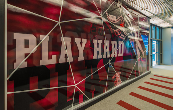
The completely remodeled Texas A&M facilities, including the training center, are full of bold design meant to inspire players and impress recruits. But nothing impresses quite like the glass tower in the main atrium that comes alive. Using infrared, the panoramic tower activates an audio-visual sensory experience that captures the atmosphere of being in Kyle Field.
“That visitor or recruit is able to understand everything of what makes gameday tradition so amazing,” Mirakian says.
The use of technology and digital design has seen a dramatic uptick in the last five years, he says. “The buildings have just become so much more interconnected and sensory and not just with training facilities,” Mirakian says. “Even concession media boards, advertising panels in the building and ribbon boards.” Advertising, in part, has pushed the move with the ability to brand an entire stadium with one company at one time a major revenue generator.
As that stadium-wide digital endeavor grows, it extends to the locker rooms. At Kyle Field each locker has animated displays with that player’s headshot, name, Twitter handle and hometown. Mirakian says that while using digital design modernizes and evolves design, more importantly it serves the client.
“You can customize all that information on a day-to-day basis,” he says. “It is highly adaptive and allows them to control their content on a real-time basis. It is a super important way to create that wow factor, but also super important practical tool for types of messaging and content.”
And while Kyle Field’s new digital design will take center stage when the completely renovated structure opens this September for SEC football, not everything is about creating a digital world. Mirakian says stadium design comes down to understanding a client.
“The key principle is listening to your client from the outset and really being committed to an in-depth visioning,” he says. “Successful projects originate with what is authentic to that specific place and client’s voice. It is the most important thing to ever drive a project.”
And that unique voice keeps the graphic treatment of a stadium unique, just like the concrete and steel that creates the architecture of a building. “You have super complex structures,” he says. “There are so many pieces, the large-scale super graphic elements, banners and pageantry to these buildings bring that final dimension.”
Key areas for Mirakian’s team includes the experiential aspect, such as at Texas A&M. That same experience needs to carry over to brand activation areas within concourses for a “high level of immersive technologically interactive display for people to engage with.”
From there, signage and wayfinding play a major role, just because of the sheer size of the structures. And then you have all the premium amenities of club spaces, suites, hospitality and even the branding and design of all the concession areas that need to catch the eye and capture the imagination of the paying customer.
Mirakian says connecting his design with the architecture of the building can really help to give a “universal opportunity to completely rebrand from an architectural, graphic design and brand activation standpoint.”
Often Populous will create their own typography to represent a voice for a building or the venue’s owner. Exhaustive image selection can lead them to customize and tailor photo shoots to capture the style they desire.
“The voice of the project has to resonate,” he says. “The stories are so different. From New York to Miami to Las Vegas to London, they are so different. The branding approach has to reflect that.”
Some projects, such as Yankee Stadium in the Bronx will get rooted in history and may use a neoclassical design language. But designing a baseball field in Miami or hockey arena in Las Vegas allows the design to turn progressive and modern. “The architectural language and graphic design language go hand in hand.”
Take Texas A&M. The tradition of the campus plays heavily in the design within the stadium, but the client’s desire to show off its progressive research side allows the design to evolve beyond the architectural form. Just like that interactive glass tower.
Tim Newcomb covers sports design for HOW Design. Follow him on Twitter at @tdnewcomb.
Courtesy HOW Magazine